
Ready to shoot something spectacular this season?
It’s been a riot of colour this summer with exhibitions like “Brasil! Brasil! The Birth of Modernism” at the Royal Academy, London and “Arpita Singh: Remembering” at Serpentine North. Fashion houses have released us from the bitter chocolate and the greige of autumn/winter with Cerulean & Tangerine, Powder Pink, Butter Yellow & Mint Green and Bubblegum Pink, Mustard, Blood Orange, to name but a few from JW Anderson, Chloé, and Chanel. Fashion has embraced colour too.
Rio Farm opened a flagship store earlier in the year, and beauty brands have gone all in with neon eyes, bold hot orange & pinks, festival glitter — bright launches like Pat McGrath Labs’ Euphoria Lights palette, Fenty Beauty’s Tropic Glow highlighter, and MAC’s Electric Playground collection.
It’s not surprising that interiors have gone the same way — look at Casa Rixo, the homeware side of fashion label Rixo, or the summer-inspired colourful collection from Maison Flaneur with its fun French-inspired pieces.
Whether you're planning your next interior brand shoot, a bold colour story, or a creative campaign that demands standout style, Love Locations has you covered. Our curated collection of colourful, characterful homes is handpicked for creative teams, stylists, production crews and interior brands who want to shoot somewhere inspiring.
This season's palette has a beautiful, fresh array of summer colours. Whether you're picking up on the pinky sunset palette with injections of yellow, coral and rust, or tuning into hyper greens and cobalt blues. If reds are your passion, oxblood, grenade, and cherry are all very high profile at the moment. Neutrals are never off-trend and have different textured surfaces, such as limed and polished. Another trend that has carried over from season to season is a shape rather than a colour – the architectural arch.
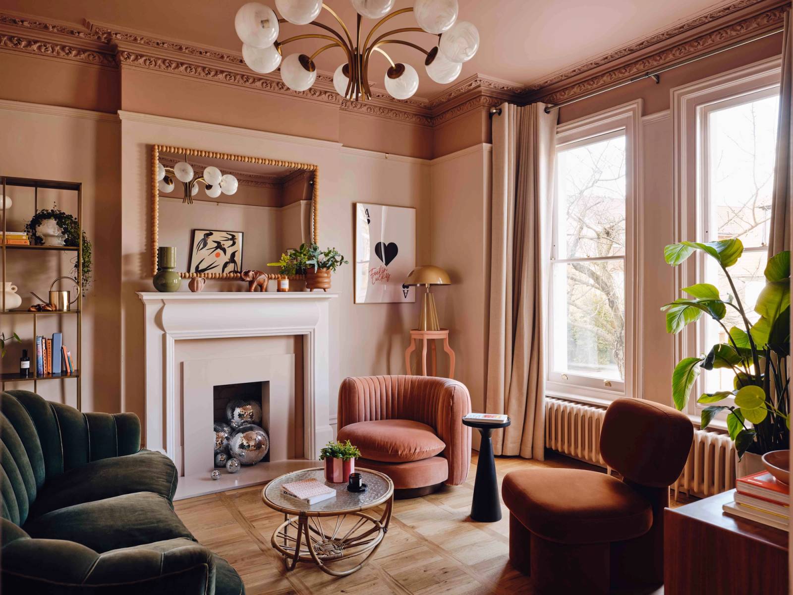
Our new location, The South Wing, is a real homage to the sunset palette. The owners have beautifully embraced colour with deep pinks and peachy plaster tones in the Victorian living room, which retains all its original features. They’ve cleverly painted the ceiling a deep rose colour and the walls a lighter pink tone.

The dining room has a cool vibe of neutral, almost bone-coloured tones on the walls and a deeper cream tone on the ceiling down to the architrave, picking out all the original features. Moving upstairs, the palette is used with different combos of darks and lights throughout the hall, bedroom, and bathroom. Then, a dressing room — a clever and luxurious use of space. The other bedroom is painted a beautiful sage green — a nice cooling off after all the warm colours. The house has arches built into doorways and as room dividers throughout, giving it a very contemporary feel. The clever colour designer is Laura Sawyer.

If you're lusting after a trendy pink kitchen, Cassio has a gorgeous open-plan area mixing in white marble surfaces. There are cleverly built-in arched cupboards bang up to date with the continuing modern architectural look.

Havant plays adventurously with colour. It uses vibrant shapes in bright yellow and dark green, with olive-painted ceilings. The real surprise is the yellow-painted kitchen diner floor. The house has been cleverly designed by interior designer Natasha. She’s mixed raw textures and upcycled materials like brick walls, wooden shutters and bare floors to give the home real soul.
Follow her: @untillemonsrsweet

For something that mixes chalky blues and greens with bold accents, look at Toucan. There’s a fuzzy peach dining space and a bright olive-green kitchen, alongside clever use of reed glass, textured bricks and amazing tiling.

To turn up the colour temperature even higher, visit Kyver, a north London split-level flat that’s a homage to Memphis style — clashing bright pinks, reds and citrus yellow framed in black. Not a square inch is left unpainted. It’s like living inside a piece of abstract art.

Medieval Manor House offers a clash of traditional and modern. Buttercup yellow features in the living area — a classic for country houses — with stripped-back walls revealing golden plaster tones.

Surrey House is a Georgian home with a modern twist. The ‘new neutrals’ palette blends soft pink, cream and grey tones. With original features and flexible space, it works for both filming and stills.
Shepherd House offers a smaller-scale Georgian option, but it’s big on colour. From pale pink walls in the living room to a sage green dining room and a whole mix of surprises throughout, it's a hard-working shoot location.
For sweetie-toned colour and clever use of space, head to Camber Sands and Dixie Daydream — a leopard-clad caravan that’s packed with charm.
Little Pink is a total homage to all things pink. The East London Victorian house has a sugar-coated bedroom with a roll-top bath and a maximalist floral living room that feels like the Chelsea Flower Show indoors.
Diss Bungalow looks like a pared-back cabin from the outside, but inside it's bursting with colour. Think neon citrus, power pink, and bowling red against a calm white living space.
Somerset mixes traditional country interiors with a vardo and caravan in the garden. It’s maximalism at its best — bold colour, pattern and charm.
If you need light and dark tones at scale — to shoot furniture and house a team — Radlett is your answer. There’s a vast open-plan living-dining-kitchen space in neutrals, offset with a dark blue living room, pinks, deep blues and emerald kitchen cabinets — plus the dreamiest designer furniture.
Need a neutral moment?
After that blast of colour, neutral tones offer a welcome pause. From every shade of white to cream, they remain some of the most requested looks. Texture becomes king — limed finishes, polished concrete, natural woods. Whether your vibe is rustic or sleek, we’ve got you covered.

Cotswolds Farm in Oxfordshire flips traditional farmhouse style on its head — think modern arches, pale woods, and subtle patterns. It still nods to traditional craftsmanship, but with vaulted ceilings and a totally modern-country feel.
Chalk House is one of our most popular neutral shoot spaces. With natural clay plasterwork, marble, and wood, plus a show-stopping pitched bedroom ceiling, it’s a must-see.

Expert’s Choice
We asked Jason Arbuckle, founder and creative director of J.Falkner, to pick his favourite Love Locations spot. You guessed it — he went bold. With a strapline like “Made in the sunshine since 2011,” it’s no surprise colour is king in his world. Splitting time between Florida and London, Jason has a great eye for vibrant design.
His pick? Our international gem, the Paris Apartment, mouth-watering colour, mosaic mirror tiles, and dreamy finishes.
Fancy creating your own colour story?
Want to create your own colour world? Explore our curated selection of painting and decorating shoot locations like Forest House and Amble.
Or explore one of our standout studios like Hatch Studio 1 — ideal for set builds— or the brilliantly flexible Brixton Warehouse.
Need some colour inspiration? Take a look at the joyfully memory-based palettes from Colour Makes People Happy — from “December in Palm Beach” to “August in the Hamptons”, the colours are drawn from life stories.
Browse the full location library or get in touch with our team to fast-track your search.